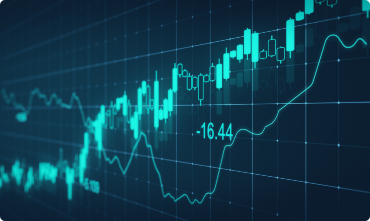
Japanese Candlestick Charts Explained
What is a Japanese Candlestick chart?
Candlestick charts were developed in Japan in the 1700s and were among the first market charts in the world. They were invented by a man named Homma when he discovered that the emotions of the traders had a large influence on the markets. Until then, the prevailing opinion was that the markets were exclusively influenced by the forces of supply and demand.Homma used his charts to dominate the rice market and his candlestick charts became popular with other traders as well. Later on, the candlestick charts were used as a popular trading tool on the Japanese stock market and it has only continued to gain popularity to this day.
The Japanese candlesticks graphically display price movements by using different colors to indicate the differences. The candlesticks can be used to detect price action patterns and make future trading decisions based on them.
How Japanese Candlestick charts work
Japanese Candlesticks are more popular than regular bar charts because they offer more detailed price action information. They are one of the most accurate tools to capture price movements within a certain time period.
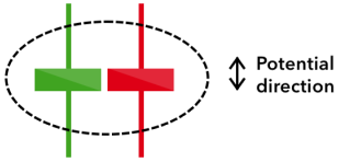
The thick portion of the candlestick indicates the difference between the open and close price of the asset being traded and it’s called the candlestick body. The top shadow is the distance between the top of the body and the highest price that the asset was traded for during the period. The bottom shadow is the distance between the bottom of the body and the lowest price that the asset was traded for during the period.
The candlestick is considered bearish or bullish depending on the closing price. If the price closes above the opening price, it is considered bullish (usually represented by a green candlestick) and if it closes below the opening price it’s considered bearish (represented by a red candlestick).
Benefits of candlestick charts
Candlestick charts are among the most common technical analysis tools for a reason. They allow the traders to:
- Evaluate the price action of an asset easily. One look at the candlestick charts and you can immediately determine what’s going on with the price of an asset.
- Easily see whether the price of an asset is in an uptrend or a downtrend. Candlesticks allow you to spot the market trends at a glance so you can quickly deduce whether the price increase is part of a trend or just a dead cat bounce.
- Recognize various market patterns. There are many market trading chart patterns that can help you predict future price movements. The candlesticks allow you to spot those market patterns and profit from them.
Candlestick patterns
As mentioned before, there are dozens of candlestick chart patterns, some of which are more popular (and more useful) than the others. We’ve selected fourteen of the more useful ones depicting various market trends that you can use to improve your trades.
Let’s start with the bullish candlestick patterns.
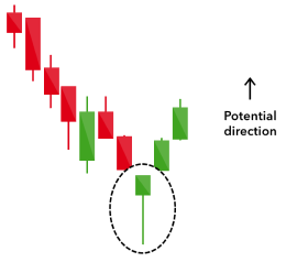
Hammer
The Hammer candlestick pattern is defined by a short body and a long lower shadow. We can usually see it at the end of a downward trend.
A hammer indicates that, despite the selling pressure that the price has seen during the day, a strong buy pressure increased the price back up before the end of the trading session.
Inverted hammer
The inverted hammer is another bullish pattern where the only difference is the length of the shadows. In this case, the upper wick is longer and the lower wick is shorter.
It can be used to detect a buying pressure that is followed by a selling pressure that wasn’t able to bring the price down. This pattern signals that the buyers will soon be the majority in the market.
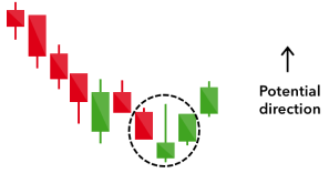
Bullish engulfing
Two candlesticks form the bullish engulfing chart pattern. The first candlestick has a shorter bearish body which is engulfed by a large green candle.
Even though the second day opens at a lower point than the previous one, the bullish market pushes the price up which results in a win for the buyers.
.
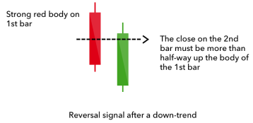
Piercing line
This pattern is formed with a long red candle and a long green candle.
Normally, we can see a large gap between the closing price of the first candle closing price and the green candle’s opening price. That signals a strong buying pressure and the price moves up to or above the previous day’s mid-price.
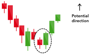
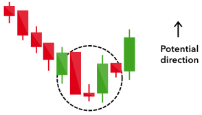
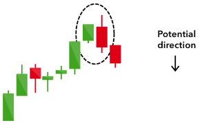
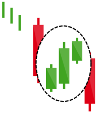
Morning star
This pattern signifies a sign of a potential trend reversal during a market downtrend. It consists of three sticks - a long red and a long green candlestick with one short candlestick between them. Usually, the short one will have no overlap with the longer candlesticks.
Morning star signifies that the selling pressure is slowing down and that the move towards the uptrend is probably coming soon.
The opposite of bullish candlestick charts is bearish candlestick patterns.
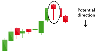
Hanging man
This candlestick chart is the opposite version of the hammer. It features the same shape but we can find it at the end of an uptrend.
The hanging man signals that we had a large sell-off during the day but the buying pressure managed to push the price back up. This sell-off often indicates that the selling pressure is overtaking the buying pressure and the reversal towards a downtrend might be coming.
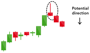
Shooting star
The shooting star is the same shape as the inverted hammer, but is formed in an uptrend: it has a small lower body and a long upper wick.
Usually, the market will gap slightly higher on opening and rally to an intra-day high before closing at a price just above the open – like a star falling to the ground.
Bearish engulfing
This chart pattern happens at the end of an uptrend. The first candle features a short green body being engulfed by a long red candlestick that comes after it.
It signals that the price has peaked or slowed down and that a market downtrend is coming up. The impact of the trend is usually signified by the drop impact in the second candle.
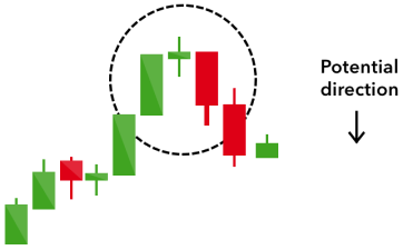
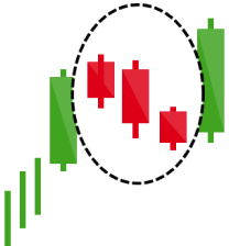
Evening star
The evening star is a pattern made up of three candles that is the opposite version of the morning star. It’s formed when a short candle appears between a long green candle and a long red candle.
It signals the reversal of an uptrend and can be especially strong when the last candlestick erases the gains of the first one.
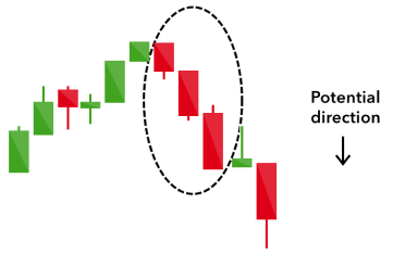
Three black crows
This pattern consists of three long red candles in a row that has short shadows. Every new session opens at a price similar to the day before. However, the selling pressure causes the price to drop lower with each session close.
The three black crows pattern usually signifies a beginning of a downtrend as the selling pressure has completely overtaken the buying pressure during three consecutive trading sessions.
The last group of candlestick patterns we’re going to take a look at our continuation patterns.
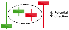
Doji
Doji charts commonly resemble a cross or a plus sign. It happens when a market’s open and close prices are almost at the same price point. This chart type is signified with a short or nobody with shadows of varying lengths.
When you encounter a Doji chart, that means that buying and selling pressures are about even and neither has gained a permanent foothold in order to establish a trend. By itself, it’s a neutral signal and it can be often found together with a morning star or an evening star.
Spinning Top
The spinning top pattern features a short candle that has shadows of about the same length on both sides. This signals market indecision and leads to no significant change in price. The buying pressure pushed the price down but the selling pressure evened it out. Spinning tops can often be seen as consolidations after a large uptrend or downtrend.
Falling three methods
This pattern helps predict the continuation of the current bearish trend. It is formed by a long red body, three small green bodies, and another red body where the green candlesticks are all formed within the range of the red bodies.
Rising three methods
The rising three methods pattern is the opposite of the falling three methods. It is formed by a long green body, three small red bodies, and another green body where the red candlesticks are all formed within the range of the red bodies. This pattern signifies that the bulls still have control of the market.
Conclusion
As we’ve seen from our candlestick charts, the investor’s emotions can affect the prices of assets as much, if not more than actual market events. Candlestick charts allow traders to understand market emotions regarding a certain stock or other asset and help them make better predictions that they can profit from.
Sources Consulted:
1. What is a Japanese Candlestick in Forex Trading? https://www.babypips.com/learn/forex/what-is-a-japanese-candlestick (2011)
2. Japanese candlestick. https://corporatefinanceinstitute.com/resources/knowledge/trading-investing/japanese-candlestick/ (2019)
3. Japanese Candlesticks. in The Visual Investor 295–300 (John Wiley & Sons, Inc., 2015). doi:10.1002/9781119197652.app2
4. Mitchell, C. Understanding a Candlestick Chart. https://www.investopedia.com/trading/candlestick-charting-what-is-it/ (2021)
5. Analyst, I. G. 16 candlestick patterns every trader should know. IG https://www.ig.com/en/trading-strategies/16-candlestick-patterns-every-trader-should-know-180615 (2020)
LimitPrime © 2026
Begin to invest and
start earning today!
Categories
Do you need personalized assistance?
READ MORE INTERESTING ARTICLES

Black Swan event is a metaphor used for the events, particular activities, or transactions that cannot be predicted or even expected to...
Read More
We have already posted about the two best day trading strategies that we recommend. Here, we will continue and write about the remainin...
Read More
After you established that your trading style is day trading, you can now think of a strategy around it and how to make it work best fo...
Read More